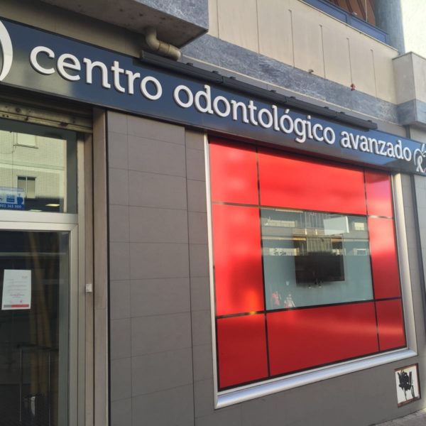
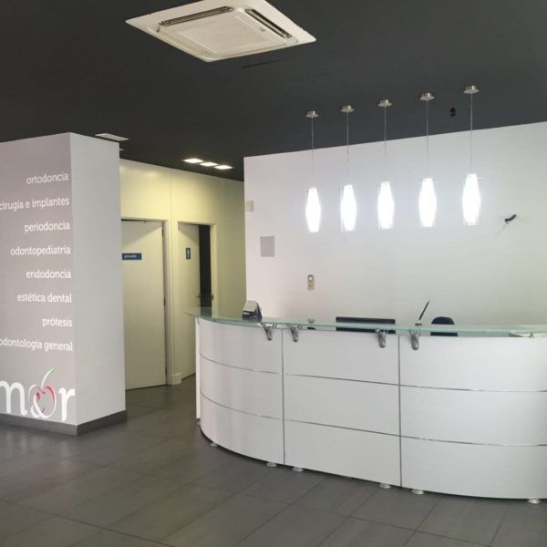
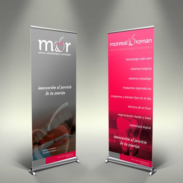
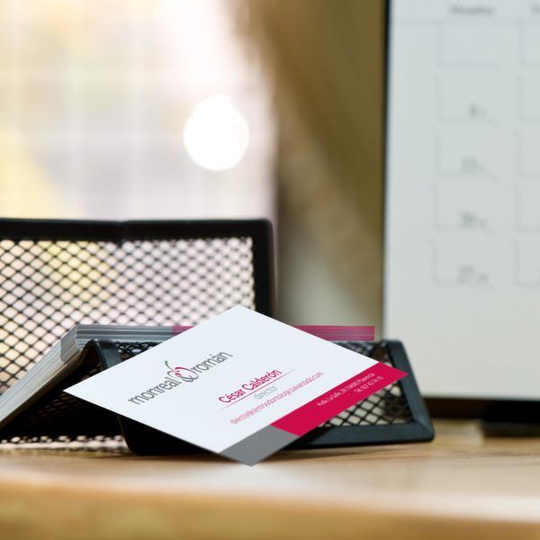
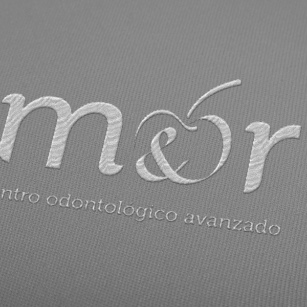
A repositioning of a brand that disassociates itself from a franchise is a double challenge for a communication company. Like all rebranding, the process must be continuous, established in time and that does not affect the end user.
The Advanced Dental Center opted for colors that transmit closeness and professionalism and together with the link of the earth (the cherry as a symbol) we created a very versatile graphic in different supports, professional and recognizable.
A challenge that is achieved with the future of the clinic, being a benchmark in innovation in advanced dental processes.
ados.


 Español
 Português
 Français